CoffeeCup Responsive Foundation Framer 2.5 Build 511 Retail

CoffeeCup Responsive Foundation Framer 2.5 Build 511 Retail
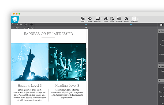
When we mapped out how our responsive apps would function, we focussed on the core of a device-agnostic design: custom breakpoints with a fully adaptable layout. After all, fanciness can only be built upon solid grounds. Curious why that is? Let’s take a look at a real design case. These are the blue dots on the image below. Now look at the layout. The two column design looks great at the current width, but at smaller screens a single column might be preferred. However, using the default breakpoints, it would need to be one or the other; either a single column or a two column for every screen smaller than 640px.
