DlhSoft Gantt Chart Light Library for WPF 4.3.39
DlhSoft Gantt Chart Light Library for WPF 4.3.39
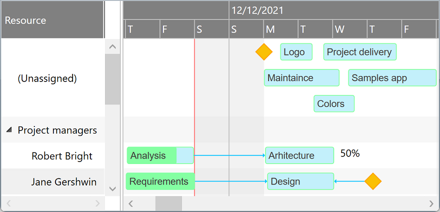
GanttChartDataGrid component displays and manages tasks and dependencies using a hierarchical data grid and an attached interactive Gantt Chart accepting drag and drop operations for scheduling task bars and creating dependency lines. Supports custom appearance settings for standard, summary, and milestone tasks for the entire chart or for individual items, as needed.
Easily add built-in or custom grid columns bound to custom item properties, set up row filtering, and display built-in thumbs to allow end users to move items vertically in the hierarchical collection using drag and drop operations.
Items collection
To load and present data with GanttChartDataGrid control, initialize the Items collection of the component, setting up GanttChartItem objects representing timeline tasks identified by these main properties: Indentation, Content, Start, Finish, CompletedFinish, IsMilestone, AssignmentsContent, and Predecessors.
Summary items are determined by checking Indentation levels of subsequent items, and can be expanded or collapsed. Standard items are presented as rectangular bars, and milestones as special diamond shapes in the view. Completion rate of a standard item is determined by evaluating CompletedFinish value, representing the date and time up to which the effort is currently considered completed. By convention, AssignmentsContent value may be a string that specifies the resource assignments of the item with optional allocation units in classic format: Resource 1, Resource 2 [50%].
Predecessors collection (objects of type PredecessorItem) defines item dependencies and are identified by these properties: Item, DependencyType, and Lag. DependencyType may be finish-to-start, start-to-start, finish-to-finish, or start-to-finish. An optional lag time span is also supported for item dependencies. Multiple types of time constraints may also be defined for Start and Finish values of task items using special properties: MinStart, MaxStart, MinFinish, and MaxFinish.
You may set an ID or GUID for any item object as Key and GlobalKey property values, useful when mapping to relational data storage access layers. A generic Tag property is also available to support miscellaneous object linking scenarios.
Drag and drop
End users may use drag and drop operations to reschedule bars, update start, finish and completion values independently, and create all types of dependencies between items directly from the chart area.
Edit and Undo operations
Copy and Paste operations are available as built-in features of the component. Data is copied to the Clipboard as tab separated values so they may be easily pasted into Microsoft Excel® sheets or other applications with tabular data import support. Move, MoveUp, and MoveDown operations allow moving selected items in the hierarchy, with or without child items. You may even configure a Thumb element in a column cell template definition to allow visual drag and drop operations for moving items around.
A built-in undo queue is available, with Undo and Redo operations that may be easily called from code.
Performance
We have designed the component to achieve maximum runtime performance, loading and displaying thousands of items while remaining highly responsive. The control has IsAsyncPresentationEnabled and IsVirtualizing properties set to true by default, so asynchronous data loading and user interface virtualization are turned on unless you set them off manually.
CUSTOMIZABLE TIMELINE
Customize working week and day time intervals, add nonworking time intervals as needed, and use built-in and custom timeline scale types with built-in or custom header interval formatting and optional vertical bars.
PROJECT MANAGEMENT
Configure and manage tasks, dependencies, resources and assignments, and build highly compatible applications using Microsoft® Project XML schema based import and export. Print and export Gantt Chart images with ease.
CUSTOMIZABLE APPEARANCE
Set up grid and chart item styling properties or define fully custom bar templates using XAML. Dependency lines can be also customized, if needed, optionally using the built in arrow polyline shape included with the library.
HIGH PERFORMANCE
User interface virtualization and asynchronous behaviors enabled by default and by design, getting the components responsive in less than 3 seconds when loading as much as 10,000 items on modern PCs.
DEVELOPER FRIENDLY
Test the product for free for unlimited time. LightSwitch® extension included for the Silverlight™ based Gantt Chart. Multiple sample applications are available, including a data access example with SQL Server® persistence.
ScheduleChartDataGrid component displays and manages resource assignments using a data grid and an attached interactive Gantt Chart displaying multiple task bars on the same resource line and accepting horizontal and vertical drag and drop operations for scheduling task bars and changing assignments. Supports custom appearance settings for tasks for the entire chart or for individual items, as needed, inheriting core features and behavior from GanttChartDataGrid component.
Items collection
To load and present data with ScheduleChartDataGrid control, initialize the Items collection of the component, setting up ScheduleChartItem objects representing resource rows identified by these main properties: Content, and GanttChartItems. GanttChartItems collection (objects of type GanttChartItem) defines timeline assignments and are identified by these properties: Content, Start, Finish, CompletedFinish, IsMilestone, and AssignmentsContent.
Standard items are presented as rectangular bars, and milestones as special diamond shapes in the view. Completion rate of a standard assignment item is determined by evaluating CompletedFinish value, representing the date and time up to which the effort is currently considered completed. By convention, AssignmentsContent value may be a string that specifies the allocation units in this format: 50%.
You may set an ID or GUID for any item object as Key and GlobalKey property values, useful when mapping to relational data storage access layers. A generic Tag property is also available to support miscellaneous object linking scenarios. Note that you can also prepare items for ScheduleChartDataGrid component from a GanttChartDataGrid instance using GetScheduleChartItems method, and then synchronize changes back to the source later.
GanttChartView component displays and manages tasks and dependencies using an interactive Gantt Chart accepting drag and drop operations for scheduling task bars and creating dependency lines. Supports custom appearance settings for standard, summary, and milestone tasks for the entire chart or for individual items, as needed.
GanttChartDataGrid component provides the same core features and behavior that GanttChartView offers, adding a synchronized data grid to allow end users to view and manage item values in an alternative fashion as well.
ScheduleChartView component displays and manages resource assignments using a data grid and an attached interactive Gantt Chart displaying multiple task bars on the same resource line and accepting horizontal and vertical drag and drop operations for scheduling task bars and changing assignments. Supports custom appearance settings for tasks for the entire chart or for individual items, as needed, inheriting core features and behavior from GanttChartView component.
ScheduleChartDataGrid component provides the same core features and behavior that ScheduleChartView offers, adding a synchronized data grid to allow end users to view and manage item values in an alternative fashion as well.
PertChartView component displays tasks events using a PERT diagram. Supports rearranging items using drag and drop operations, computing events based on items displayed by existing GanttChartDataGrid component instances, and custom element templates.
Warning! You are not allowed to view this text.