Telerik UI for ASP.NET Core R2 2019 SP1 (v2019.2.619) Retail
Telerik UI for ASP.NET Core R2 2019 SP1 (v2019.2.619) Retail
Cut development time, while delivering rich, powerful, modern websites and apps. Telerik® UI for ASP.NET Core offers 60+ jQuery-based components ranging from must-have HTML helpers for every app like Grids, Dropdowns and Menus to advanced line-of-business controls such as Charts, Gantt, Diagram, Scheduler, PivotGrid and Maps.
Despite the variety of built-in functionality the product offers, we continue to release new functionality based on customer feedback three times a year. Feel free to suggest product ideas for the community to vote on in Telerik feedback portal—the more votes your suggestion receives, the higher priority it becomes to introduce into our roadmap.
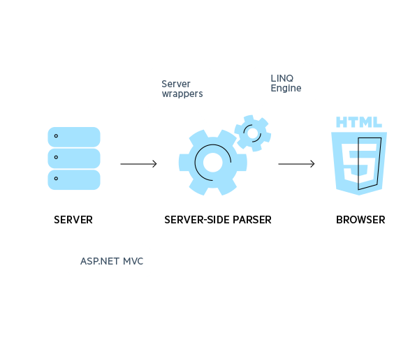
Telerik ASP.NET Core components are comprised of Telerik award-winning Kendo UI HTML5/JS widgets and their server-side wrappers for ASP.NET Core. The wrappers generate the jаvascript and HTML required by the Kendo UI widgets enabling you to use C# to configure them. Telerik UI for ASP.NET Core ships the same built-in functionality as Kendo UI, but offers Core-specific features on top, including:
Server-side data binding and in some cases server-side rendering
Support for unobtrusive validation based on Data Annotation attributes
Visual Studio Intellisense for the server-side configuration syntax
Visual Studio Extensions for automatic creation of new applications
Built-in editor templates and more
Mobile Support and Responsiveness
Telerik® UI for ASP.NET Core saves you time and effort when implementing responsive design practices, because the controls take care of them out-of-the-box or with the change of a single property:
All components render larger clickable areas on small screens and scale proportionately to the container in which they are placed
All components integrate well with grid-layout frameworks, such as Bootstrap and Zurb Foundation
The complex and popular components, such as Grid and Scheduler, serve different rendering on small screens to provide optimal user experience.
Simple Server-Side Data Binding and CRUD
If you are familiar with server-side programming, it can be hard to work with data in HTML5. Telerik UI for ASP.NET Core makes data binding simple. Use your existing server-side data access technologies to quickly bind data to the UI widgets via our DataSource component. With it, you can define endpoints for read and data editing operations, as well as mappings for requests between .NET and jаvascript.
Built-In, Yet Customizable Themes
With UI for ASP.NET Core, you build sleek, modern apps without a designer on-hand. Registering the CSS styles of the theme on the page is all it takes to theme your project with one of the 11 out-of-the-box skins. To apply the professional themes on normal HTML elements, like buttons and inputs, simply use the basic CSS classes included in UI for ASP.NET Core.
Transforming the ready-made themes to perfectly match your site is also easy when using the ThemeBuilder tool. With the point-and-click configuration wizard, your new themes are ready in a matter of seconds.
Use Bower and Nuget
Popular package management and task automation solutions such as NuGet, Bower and Gulp are made first class citizens in ASP.NET Core. That means every web developer can use Bower for client packages, NuGet for server packages and Grunt/Gulp for compilation, minification, etc., when building web apps.
UI for ASP.NET Core takes advantage of these tools by providing a Bower feed for its client scripts, and a NuGet feed, hosted on our NuGet server, for its server wrappers implementation (see this help topic for details). Furthermore, you can build a custom script from the source using Grunt by following these steps.
Cross-Platform Development
Probably the most significant feature of ASP.NET Core is the introduction of the new light and modular .NET Core runtime, which is OS-neutral. For the first time in .NET history, you can build applications and deploy them on Windows, Linux and Mac OSX devices. And on top of all that, it’s an open source solution so it’s free!
UI for ASP.NET Core fully supports the .NET Core runtime, and helps you build beautiful responsive web experiences crossing the boundaries of the Windows world.
Tag Helpers Overview
Tag Helpers are the HTML-friendly way to create views and define UI in ASP.NET Core applications. As of R2 2018 we now offer Tag Helpers for all of the components in the suite, including but not limited to the following:
AutoComplete
The AutoComplete has a Tag Helper which allows devs to lay out all available options in a HTML-like fashion or bind to various data sources in a declarative way.
Barcode
Thanks to the introduction of Tag Helpers, the Barcode component can be completely declaratively configured with a HTML-like syntax.
Button
The Button component can now be added to a page through its Tag Helper, enabling the advanced functionality of the component to be used in a similar syntax to the rest of the HTML on your page.
ButtonGroup
With the support for Tag Helpers, the ButtonGroup component can be completely declaratively configured with a HTML-like syntax.
Chart
Adding advanced data visualization with a simple HTML-like syntax has never been easier thanks to the Chart’s support for Tag Helpers in ASP.NET Core.
ColorPicker
Add the ability for users to select color to any form in a natural HTML-like way thanks to the Color Picker’s Tag Helper.
ComboBox
With Tag Helpers the ComboBox can be configured with a declarative HTML-like syntax and easily be bound to local and remote data.
DataSource
As the core of many data-bound components in UI for ASP.NET Core, the DataSource Tag Helper can be created declaratively and shared between multiple other components through their Tag Helpers and bind to local and remote data with ease.
DateInput
The DateInput Tag Helper allows developers to use a HTML-like syntax to add this advanced input element to any new or existing form.
DatePicker
Thanks to the DatePicker Tag Helper developers can now add date selection through a pop-up calendar with an easy-to-use HTML-like syntax.
DateTimePicker
Thanks to the introduction of Tag Helpers, the DateTimePicker component can be completely declaratively configured with a HTML-like syntax.
Dialog
Integrating a dialog component in to existing ASP.NET Core applications has never been easier with the Dialog Tag Helper.
Drag & Drop
Provide drag-and-drop capabilities to any existing HTML elements, or advanced components like the other UI components in UI for ASP.NET Core, with a declarative HTML-like syntax with the Drag and Drop component’s Tag Helper.
DropDownList
With Tag Helpers the DropDownList can be configured with a declarative HTML-like syntax and easily be bound to local and remote data in order to display a list of data to select from.
Grid
The Grid component is offered as a Tag Helper enabling developers to lay out the Grid and its configuration in a simple and easy-to-ready HTML-like declarative way. This included binding to local and remote data and can be done with even the most advanced Grid set ups.
LinearGauge
Adding gauges and data visualization with a simple HTML-like syntax has never been easier thanks to the LinearGauge’s support for Tag Helpers in ASP.NET Core.
MaskedTextBox
The MaskedTextBox Tag Helper allows developers to use a HTML-like syntax to add a masked input element to any new or existing form.
MultiSelect
The MultiSelect adds a Tag Helper which allows devs to lay out all available options in a HTML-like fashion or bind to various data sources in a declarative way.
Notification
Quickly add notifications anywhere in your application through a HTML-like syntax thanks to the Notification Tag Helper.
NumericTextbox
The NumericTextbox Tag Helper allows developers to use a HTML-like syntax to add this advanced input element to any new or existing form.
Popup
Use the Popup Tag Helper to let any set of HTML elements appear in a popup anywhere in your application.
ProgressBar
Indicate the current status of any process through a HTML-like syntax with the ProgressBar Tag Helper.
QR Code
Thanks to the introduction of Tag Helpers, the Barcode component can be completely declaratively configured with a HTML-like syntax.
RadialGauge
Adding gauges and data visualization with a simple HTML-like syntax has never been easier thanks to the RadialGauge’s support for Tag Helpers in ASP.NET Core.
ResponsivePanel
Provide any application with the ability to display a hamburger menu for smaller menus all through a HTML-like syntax with the ResponsivePanel’s Tag Helper.
Slider
Use a HTML-like syntax to provide the ability for users to select a value on a sliding scale thanks to the Slider Tag Helper.
Sortable
With the Sortable Tag Helper developers can use a HTML-like declarative approach to empower users to re-arrange HTML elements and advanced widgets on a page.
Splitter
Create expandable and collapsible panels with a HTML-like syntax through the Splitter Tag Helper.
TimePicker
Thanks to the TimePicker Tag Helper developers can now add time selection through a pop-up with an easy-to-use HTML-like syntax.
ToolBar
Add tool bars through a HTML-like syntax to any web page in a ASP.NET Core application with the ToolBar Tag Helper.
Tooltip
The ToolTip Tag Helper gives the power to add tooltips to any element or advanced UI component through a declarative HTML-like way.
Upload
The Upload Tag Helper gives a rich HTML-like syntax to create an upload area to any ASP.NET Core application.
Validator
Take client-side validation to the next level and integrate with existing model validation in ASP.NET Core with the Validator Tag Helper.
Window
Add a window that can be used as a modal, be interacted with through maximizing or minimizing, anywhere in your application through a HTML-like syntax thanks to the Window Tag Helper.
Conversational UI - Modern UI for Chatbots
The Conversational UI control (aka RadChat) is a new control intended to be used with various chat bot services. Highlights of the features include:
Built-in hero cards
Built-in suggested actions
Built-in simple message and typing indicator
Custom card/attachment templates
Easy connectivity to chat bot services (Azure/Microsoft Bot Framework, Wit.ai, Amazon Lex)
UI for ASP.NET Core R2 2019 SP1
Common
NEW
Support for .NET Core 3.0 Preview 6
Add minified version of the Kendo scripts files within @progress/kendo-ui and kendo-ui-core npm packages
FIXED
Show event of the View fires twice
JS error on expanding widgets due to R2 2019 compatibility issue with jQuery 1.10.x, 1.11.x, 2.0.x and 2.1.x
Add notify method in kendo typescript definitions
AutoComplete
NEW
Kendo and Google Chrome Autocomplete open Simultaneously
FIXED
Popup property is missing from dropdowns TypeScript definitions
Horizontal scroll bar is displayed in the dropdown even if autoWidth is enabled
Button
FIXED
Missing Button shadow in normal state with LESS Material theme
ButtonGroup
FIXED
Incorrect active-focused background color of ButtonGroup buttons in Material theme
Calendar
FIXED
Calendar throws JS error in Century view on decade navigation.
Calendar disabled dates breaks Year/Month view keyboard navigation.
ComboBox
NEW
Kendo and Google Chrome Autocomplete open Simultaneously
FIXED
ComboBox item selection issue when using "filtering"
Popup property is missing from dropdowns TypeScript definitions
Virtualized ComboBox in grid maps to text field on cellClose
Horizontal scroll bar is displayed in the dropdown even if autoWidth is enabled
ContextMenu
FIXED
Еrror when removing non-existing item from ContextMenu
DateRangePicker
FIXED
Placing TABLE in the DateRangePicker footer template throws JS error
Drawer
NEW
Add Drawer Scrolling Styles for Mozilla
FIXED
Drawer improvements for invalid mode and minHeight behavior.
DropDownList
NEW
Kendo and Google Chrome Autocomplete open Simultaneously
FIXED
Popup property is missing from dropdowns TypeScript definitions
DropDownList fails to group items by 0.
Horizontal scroll bar is displayed in the dropdown even if autoWidth is enabled
Group headers are not set correctly when group field is null or empty
DropDownTree
NEW
Kendo and Google Chrome Autocomplete open Simultaneously
FIXED
Popup property is missing from dropdowns TypeScript definitions
Excel Export
FIXED
Kendo.Mvc.Export.dll SetCellValue method should handle null values
Grid
NEW
Setting a custom filter widget for a boolean column does not work
Accessibility improvements for adaptive rendering of Grid
FIXED
MultiSelect inside Grid loses its text visibility when using Nova skin
Column resize handle is displayed at incorrect position
PersistSelection fails to work in MVVM Grid
The scrollbar of the Grid with virtualization has wrong height in IE with jQuery 3.*
Kendo UI Grid does not open cell for editing on last row with scrolling in iOS device
Missing last header when all columns in a grid are Multi-header columns
Grid with locked columns and virtual scrolling goes out of sync when the browser window is resized
Grid column menu button is not highlighted with Office 365 and Metro themes when a column is filtered
Insufficient color contrast of Grid pager info in Office365 theme
Kendo.Mvc.Export.dll SetCellValue method should handle null values
In the Grid, if a column field matches another column title, the menu hides the wrong column
Grid's column filter submenu has incorrect tooltips
Pager _click does not parse the page number to integer
Reordering duplicate columns/template columns does not reorder properly columns in the column menu
Add cursor:default in Grid Heading
Grid clear filter icon is misaligned for LESS themes
Grid checkbox column selection is out of sync when items are selected with drag-drop or with Shift key.
Grid sort column style not applied correctly for SASS themes.
Unexpected text-decoration: underline style on Grid's filter icons in exported PDF
Column reordering with multi column headers causes mixing of the column titles
DataSource filter in getOptions is not copied
Grid row becomes selected on command's icon click
ListView
FIXED
ListView: The scrollable behavior is enabled when height style is applied to the Kendo UI ListView wrapper element
Menu
FIXED
Menu hierarchical items are not expanded the first time when hovered
The ResponsivePanel closes immediately on mobile devices after it is opened in Chrome due to passive event listener
MultiColumnComboBox
NEW
Kendo and Google Chrome Autocomplete open Simultaneously
FIXED
Popup property is missing from dropdowns TypeScript definitions
MultiSelect
NEW
Kendo and Google Chrome Autocomplete open Simultaneously
FIXED
Popup property is missing from dropdowns TypeScript definitions
MultiSelect inside Grid loses its text visibility when using Nova skin
Tapping over a MultiSelect then scrolling throws a js exception and opens the widget's dropdown
l.select(...).done is not a function error is thrown when delete the selected item after filtering.
Removing MultiSelect tag does not trigger change event with jQuery 3.3.1
Horizontal scroll bar is displayed in the dropdown even if autoWidth is enabled
MultiViewCalendar
FIXED
Multiple dates can be selected on mobile devices when selection mode is "single"
Notification
FIXED
Missing Notification icon right margin
PDFViewer
NEW
Extend pdfjsprocessing file usage in wrappers and typescript
FIXED
Using Custom Build with PDFViewer checked throws an error
PDF files with capital case file extension are not rendered
Pager
FIXED
Pager _click does not parse the page number to integer
ResponsivePanel
FIXED
The ResponsivePanel closes immediately on mobile devices after it is opened in Chrome due to passive event listener
Scheduler
FIXED
Adaptive scheduler with editable false renders create button
Scheduler events overlap additional days slots with small screen resolutions
Scheduler in SignalR scenario does not fully update its UI
Cannot read property 'firstSlot' of undefined thrown when remote resources with grouping and autoBind: false are used
Scheduler events width not properly calculated in RTL scenarios when a scrollbar is displayed
jаvascript error thrown on saving Scheduler event with invalid date format entered in Start/End inputs
Select method throws error in monthview
Scheduler is scrolled into view, when a time slot/event is focused
ScrollView
FIXED
Initializing ScrollView with one item and disabled paging shows the Next arrow
Spreadsheet
FIXED
Spreadsheet throws a js exception on exporting to Excel
Spreadsheet bad performance on setting font size to multiple cells
Pasting data from Excel file to Spreadsheet results in an image instead of data values
Decimal values are not displayed when negative percentage value is filled in a cell
Spreadsheet custom editor button is not visible in frozen columns scenario
Spreadsheet opens only 200 rows from previously exported document
Unable to reach last column custom editor button
Negative floating point numbers are represented without the zero
Spreadsheet widget cannot be scrolled under Android
Switch
NEW
Automatically move input classes to the wrapper of the widget
Tooltip
FIXED
Tooltip disappears when the page is scrolled and the container has overflow: auto
TreeList
FIXED
TreeList resizes incorrect column
TreeList pager doesn't change its UI correctly upon refresh button click.
TreeList "Status" element breaks widget layout upon resize method call
TreeList "No records to display" is displayed below pager.
TreeList MVVM bindings stop working if a column template contains a table
Reordering duplicate columns/template columns does not reorder properly columns in the column menu
Kendo Treelist removing wrong col element when hidin column
TreeView
FIXED
NumericTextBox losing focus inside TreeView template in Chrome
Wrappers (ASP.NET Core): DataSource
NEW
Allow setting request headers in data source configuration
Wrappers (ASP.NET Core): Grid
FIXED
IgnoreCase property is missing for the filterable options of the column
ASP.NET Core Grid Razor Pages does not find editor templates in Areas
Nested DropDown editors in detail Grid throw errors when there are "\r\n" new lines in text
Grid Accessibility in MVC wrappers table header
Wrappers (ASP.NET Core): ToolBar
NEW
Add spacer CommandType to ToolBar
Wrappers (ASP.NET Core): TreeList
FIXED
TreeList parentId should be nullable by default
There is no indent in the TreeList when a command column is first
Wrappers (ASP.NET Core): TreeView
FIXED
TreeViewItemModel does not properly pass its HtmlAttributes members on populating ASP.NET Core wrapper TreeView with BindTo()
Warning! You are not allowed to view this text.