Telerik UI for WPF R2 2020 (version 2020.2.513) Retail
Telerik UI for WPF R2 2020 (version 2020.2.513) Retail
Telerik UI for WPF includes a wide range of controls from small UI components like Rating to powerful data-driven controls like GridView. The suite provides a variety of data visualization tools to allow you to display and edit your data. Manipulate your row data in a GridView or Spreadsheet and then visualize it through PivotGrid, our charting or diagramming tools. Discover multiple components for daily or business planning such as ScheduleView where users can easily plan their day and GanttView which allows users to visualize and manage any project planning data. Telerik UI for WPF comes complete with customizable UI controls for a variety of needs and options, which makes it the ideal choice for any Windows desktop application.
Professional-Looking Themes
Give your applications the professional look by applying our built-in themes. Telerik UI for WPF ships with more than ten professionally designed themes. Windows8 and Windows8Touch let you apply styling in real-time. While the new Visual Studio 2013 theme mimics the look and feel of VS 2013.Themes include:
Visual Studio 2013
Office2013
Windows8
Windows8Touch
Summer
Vista
Windows7
Expression_Dark

Exceptional Performance and User Experience
Telerik UI for WPF enhances user experience by providing both UI and data virtualization. Use Teleriks controls to display large amounts of data with virtually no performance trade-off. What you get is exceptional performance and a sleek end-user experience. Telerik UI makes your apps fast by:
Producing minimal and clean XAML
Allowing you to load only the data within the current viewport of the application
Implementing lazy loading loading data only when it is requested
Minimizing memory usage, robust code free from memory leaks.

Intuitive API
Telerik UI for WPF has a short learning curve and is easy to use. The suite provides for:
Seamless integration with your Visual Studio Toolbox for quick drag-and-drop usage.
Feature configuration using Design-time Wizards.
Easy to learn API. The API is a close mirror of Microsoft. If youve worked with the WPF Framework and Microsofts XAML Controls, youll get up and running fast in Telerik UI for WPF.

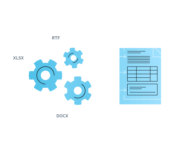
Document Processing
Three components enable you to process the most common text, spreadsheet, and PDF file formats without having Microsoft Office or other third-party libraries installed. Your application users will be able to create, load and modify documents in a variety of formats including:
DOCX
RTF
TXT
HTML
XLSX
CSV
Tab-delimited
Enable your application to seamlessly export and import documents or convert them from one format to another. All thanks to the intuitive and easy-to-use APIs.

MVVM Support
The ability to drag-and-drop a complex control from our toolbox, wire up a few events, receive quick functionality, then move on to the next work item makes your software development easier. Those functionalities, however, do not guarantee that the software created is well structured, easily extensible, and unit testable. MVVM resolves those issues. Telerik UI for WPF fully supports MVVM, allowing you to create reliable, well-structured and easily maintainable applications.

UI for WPF R2 2020
What's New
NEW
Assemblies and NuGet packages for .NET 5.0 Preview 3 are now available.
Introduced .Net Core Project Converter that converts WPF projects targeting .NET Framework into .NET Core projects to ease out the migration.
Callout component can be used to display important information in tooltip/popup scenarios. The control offers flexible customization of the body and arrow geometries, as well as various animations via CalloutPopupService class.
(Beta) NotifyIcon control allows you to show an icon in the taskbar notification area and handle user interaction with it. Show notifications, statuses and available options in the most suitable way, through a popup, tooltip, balloon or context menu.
Content controls are parts of the document that have specific input behavior. This feature can be used for creating rich interactive forms, which can be edited in the control and then persisted in the exported document. Content controls support different input control types (CheckBox, ComboBox, Calendar), editing restrictions, separate styling options etc. UI change of properties is also supported through properties dialogs.
Introduced support for creating custom time indicators and controlling their current time in the ScheduleView component.
Implemented support for displaying hierarchy (sub-items) in the NavigationView component.
Keyboard search navigation support is now available for PanelBar, PropertyGrid and TreeView components.
All Controls
CHANGED
Ripple effect can't be removed when StyleManager is applied for the Fluent and Material themes. The FluentControl and MaterialControl, used for both themes did not reset their theme properly. They no longer implement IThemable's ResetTheme method as they are used only in the scope of the corresponding theme and do not need to do so.
Breadcrumb
FIXED
The focus visual state is missing in the VisualStudio2019 theme.
ChartView
FIXED
[NET Core] The special ChartView design-time features were missing in NetCore designer.
ComboBox
FIXED
The Background, BorderBrush and BorderThickness setters applied through the editable ComboBox's TextBoxStyle are not respected.
Changing the Background of the PART_EditableTextBox changes the same of the PART_DropDownButton inside the EditableComboBox.
Diagrams
FIXED
System.IO.IOException is thrown in some scenarios when the DiagramCursors are created.
Docking
FIXED
Content elements inside a RadPaneGroup (not in the DocumentHost) with a single RadPane cannot be selected in the designer.
Setting a theme, different than the ApplicationTheme, using StyleManager, does not apply properly.
ExpressionEditor
FIXED
Setting the ExpressionText to null causes a NullReferenceException.
FileDialogs
FIXED
The FileName is wrong when selecting a drive from the navigation tree in the OpenFolderDialog.
FilePathPicker
NEW
Implemented functionality of setting the FilePath when a file is dropped over the control and the AllowDrop property is set to True.
GridView
NEW
Introduced CrossThreadCollectionchangedInterval property. It sets the interval at which Collectionchanged events from a background thread are dispatched to the UI thread. The default value is TimeSpan.Zero - each Collectionchanged event is dispatched without any batching. If not TimeSpan.Zero, Collectionchanged events are aggregated and sent to the UI thread for processing them at once.
Introduced a property called MouseWheelScrollLines which determines how many rows are scrolled with the mouse wheel.
FIXED
The ColumnGroups element, positioned above the HierarchyExpandButton column, gets horizontally scrolled.
Degraded performance when loading items from a background thread, one by one, using the Add method. You can also improve the performance by using the new CrossThreadCollectionchangedInterval property.
Fixing delete functionality when the RadGridView is populated with items implementing from IList.
The element with x:Name Part_HierarchyIndentPresenter gets scrolled in all themes after the VisualStudio2013 theme - Office2016, Office2016Touch, Green, Material, Fluent, Crystal and VisualStudio2019.
Upper rows are not visible when row details are collapsed and RadDataPager is used
NuGet: A wrong dependency is added when installing the SpreadsheetStreamingExport package.
CHANGED
Control panel items have transparent background by default and are not visible when the ShowGroupPanel property is set to False in the Material theme. The default background of the items is now changed to PrimaryNormalBrush (the same color as the group panel).
The assembly resources, used in the default styles for each of the themes, have duplicate names as the Controls assembly resources. Following the implicit styling mechanism and merging the theme files, causes unexpected look depending on the order of merging. Each resource from the GridView assembly now has a "GridView_" prefix - e.g. ControlOuterBorder is now renamed to GridView_ControlOuterBorder.
LayoutControl
FIXED
DragDropManager.MinimumHorizontalDragDistance and DragDropManager.MinimumVerticalDragDistance are set to 0 in the constructor of the LayoutControlToolBoxView.
Missing LayoutControlSplitter_Foreground resource in Windows8Touch theme leads to design-time error and no possibility for extracting the style of LayoutControlSplitter.
ListBox
FIXED
Selected item is scrolled out of view if the ItemsSource is changed while the Window is showing and the ItemsPanel is StackPanel.
Map
NEW
Introduced the ClustersInvalidated event in VisualizationLayer which notifies when clusters are re-calculated.
FIXED
Cannot specify multiple HazardousMaterials and multiple HazardousPermits in the BingRestTruckRouteRequest.
The layer property is not updated when changing the Open Street Maps layer in the UI.
TheMode property of ArcGisMapProvider is not updated when the mode is changed from the UI.
KMLReader does not read more than one InnerBoundaryIs tag.
CHANGED
The Pushpin was hardly visible when using the Crystal or the VisualStudio2019 theme as its color was white. It is now changed to AccentSelectedBrush for the Crystal theme (#1C83FF) and for the VisualStudio2019 theme - AccentSecondaryDarkBrush (#40508D).
MultiColumnComboBox
FIXED
InvalidOperationException is thrown when programmatically adding items to the SelectedItems collection after the dropdown has been opened.
NavigationView
NEW
Implemented support for displaying hierarchy (sub-items) in the NavigationView component.
FIXED
The PaneToggleButton element remains visible when setting PaneHeaderHeight to 0 in Office2013 theme due to the button's default MinHeight of 26px coming from the default RadToggleButtonStyle.
The PaneHeader area is still visible when the PaneHeaderHeight is set to zero and the control is in its Minimal mode.
PanelBar
NEW
Introduced keyboard search navigation support.
PDF Viewer
NEW
Implemented support for form fields in ThumbnailFactory.
Implemented support for respecting Custom UI Layers in ThumbnailFactory.
Introduced API for refreshing the page UI after a change in the page content.
[Preview] Implemented support for importing documents using the PdfProcessing model.
FIXED
Missing text content caused by handled InvalidCastException while parsing Type1 font file.
NullReferenceException is thrown when Printing a document which is still not loaded.
PdfProcessing
NEW
Provided API for clearing the registered fonts in the FontsRepository.
Support for WMF/EMF images when exporting documents to PDF.
Implemented rename functionality for interactive form fields.
Provided an Exception handling mechanism when importing and loading documents content.
FIXED
ArgumentException is thrown while importing choice field with an empty string for a value.
Incorrectly applied glyph widths after importing and exporting a document.
Whitespaces are ignored when exporting text with char spacing using TextFormatProvider.
Form Fields are not copied when merging documents.
Importing DecodeParms containing null or stream object results in missing image.
Inserting large image file with non-default ImageQuality setting causes OutOfMemoryException.
ImageQuality property is not retrieved properly from the format provider.
PivotGrid
FIXED
Wrong translation of the "Sort Z to A" string in French culture.
ProgressBar
FIXED
The default background, applicable for the ProgressBarTrack element when the control is not in its indeterminate state, is currently white and invisible on white application background until it starts to fill for the Office2016 and Office2016Touch themes. It is now the theme palettes' PrimaryBrush (light gray).
PropertyGrid
NEW
PropertySetValueChanged event is now raised after PropertySetViewModel has updated all ViewModels.
Introduced keyboard search navigation functionality.
RibbonView
FIXED
When the RadRibbonWindow.IsWindowsThemeEnabled property is set to False and the IsTitleVisible property is set to True in the Fluent theme, the minimize, maximize and close buttons of the window exceed the height of the RibbonTitleBarPanel.
Header buttons cannot be clicked when Per Monitor DPI Aware is enabled and the Window is on display with different DPI.
RichTextBox
NEW
Content controls are parts of the document that have specific input behavior. This feature can be used for creating rich interactive forms, which can be edited in the control and then persisted in the exported document. Content controls support different input control types (CheckBox, ComboBox, Calendar), editing restrictions, separate styling options etc. UI change of properties is also supported through properties dialogs.
FIXED
Typing using Telugu generates additional spaces after the typed content.
After restarting the numbering of a level, the upper-level numbering is also modified.
ScheduleView
NEW
Support for adding a custom time indicator and positioning it on top of the appointment.
Introduced support for creating custom time indicators and controlling their current time in the ScheduleView component.
FIXED
High importance icon in edit appointment dialog is pixelated in Office2016, Office2016Touch, Material, Fluent and Crystal themes
Low importance icon in edit appointment dialog is not visible in dark variations of Fluent and Crystal themes.
The default appointment tooltip is not themed correctly when the theme is set using StyleManager.
CHANGED
TimeRulerItem`s FontSize is changed to be 12px in Day, Week and Timeline View for Fluent theme.
Slider
NEW
Exposed ThumbToolTipStyle property. It can be used to customize the ToolTip of the slider thumbs.
SplashScreen
NEW
Introduced ImageStretch, ImageWidth, ImageHeight, FooterHorizontalContentAlignment properties on the RadSplashScreen and SplashScreenDataContext.
SpreadProcessing
FIXED
Cell references are not translated to other worksheets after inserting/removing rows/columns from the worksheet containing the cell reference.
The Lookup function does not work with text values.
NullReferenceException is thrown when importing documents containing elements in a non-default namespace.
Spreadsheet
FIXED
Cell references are not translated to other worksheets after inserting/removing rows/columns from the worksheet containing the cell reference.
NullReferenceException is thrown when importing documents containing elements in a non-default namespace.
Synchronize print settings from WorksheetPageSetup to the printer when printing.
SyntaxEditor
NEW
Introduced TextSearched event which is fired when searching in the control.
Introduced a property to control whether the matching of the start and end folding tags is case sensitive or not.
FIXED
ArgumentOutOfRangeException is thrown in XmlFoldingTagger when deleting last '>' symbol in the XML file.
Enter key does not produce new line if syntax editor is placed in secondary window in WPF application.
Folding buttons are misplaced after resizing of the control.
Space key does not enter text and results in lost focus when the control is hosted in RadListBox.
String literals are not recognized and colored in C#, VB, JS, SQL documents.
ArgumentOutOfRangeException is thrown in CSharpFoldingTagger when two consecutive lines of the document have '//' comments preceded by non empty strings.
TabbedWindow
NEW
New PrepareNewWindow virtual method introduced to allow replacing the tabbed window instance created when you drag out a tab from its parent window.
FIXED
InvalidOperationException is thrown in some scenarios when interacting with two windows shown in different threads and using the Fluent theme.
Tabs panel separator borders are not stretched properly and look misaligned in the Green and Material themes when the height of the tab items is bigger than default (e.g. 100 px).
TabControl
NEW
Introduced visual states and triggers which represent the currently selected tab item inside the control's DropDown menu.
Toolbar
FIXED
Custom styles are not applied in an MVVM scenario.
ToolTip
CHANGED
The ToolTipContentView does not inherit the FontFamily and FontSize properties from the ToolTip and they are not properly updated through the themes' palettes for the Windows8, Windows8Touch, Office2013, VisualStudio2013, Green, Office2016, Office2016Touch and Material themes.
TreeList
FIXED
Expander buttons are clipped when there is a horizontal scrollbar.
MouseOver or Expand/Collapse effect appears on a different row (the recycled one) from the clicked one.
TreeListViewRows are collapsed unexpectedly while scrolling in scenarios with IsExpandedBinding and TabNavigation set to Once
CHANGED
TreeListViewRowAutomationPeer now overrides GetLocalizedControlTypeCore and returns 'tree list view row' instead of 'grid view row'.
TreeView
NEW
Provided ability to set the HorizontalScrollBarVisibility and VerticalScrollBarVisibility properties of the ScrollViewer through TemplateBindings instead of using hard-coded values.
Implemented keyboard search navigation support.
FIXED
Selection is not updated when using the arrow keys if the currently selected item is outside the viewport.
VirtualGrid
FIXED
Incorrect row/column index in VirtualGridCellClipboardEventArgs when one or more rows/columns are pinned.
VirtualizingWrapPanel
FIXED
There are missing items in the panel when adding and removing from the data source in .NET 4.5.
When using VirtualizingWrapPanel, ArgumentOutOfRangeException is thrown when items are removed from the collection.
Window
FIXED
When PerMonitorDpiAwareness is enabled, window cannot be dragged to the end of the second monitor (with lower DPI).
WordsProcessing
NEW
Introduced support for exporting Line breaks to plain text format.
FIXED
Exception when using multiple instances of RtfFormatProvider.
NullReferenceException is thrown while importing HTML document containing a link element that has style attribute.
HtmlFormatProvider: jаvascript code is considered as text and inserted into the document.
NotSupportedException is thrown when exporting documents with WMF/EMF image to PDF.
Coded UI Tests
All components in Telerik UI for WPF support Level 1 Coded UI tests and most of the controls already support Level 3 Coded UI tests, making Telerik UI Controls easily maintainable within any test-driven development process.
Touch Support
The built-in touch support and the Windows8Touch theme make your Telerik UI for WPF powered applications run smoothly on a touch device.

Drag and Drop Support
Many Telerik UI for WPF controls come with built-in drag and drop support. The suite also provides a DragDropManager which easily integrates within your solution to implement any drag and drop scenario.
Warning! You are not allowed to view this text.